Monday, January 31, 2011

Grzegorz Domaradzki's Vector Movie Posters

I love and despise the Internet at the same time. On the one hand, with the Internet I can get step-by-step directions to just about anywhere, I can get a 50" television for an insanely low price, I can download entire seasons of television series that only plays in the UK, and discover amazing new artists who I'd have never heard of otherwise. On the other hand, I can find amazing artists who have more creativity in their pinky finger than I would have in three of me combined (cue the shame spiral). Case in point, Polish graphic designer Grzegorz Domaradzki (AKA Gabz). He created a series of movie posters as a personal project, and they're amazing! The only bummer (and it's a big one) is that these aren't real posters and can't be purchased anywhere.

In Grzegorz's words:
"I start with Adobe Illustrator working on portrait photography found in the internet using Bamboo tablet. Once finished I paste it into Photoshop and start designing the posters, adding typography, textures, effects, filters and all sorts of adjustment layers."
I've chosen four of my favorites, but you can view the rest of posters through his Behance Network portfolio. Volume 1 consists mostly of newer films while Volume 2 has more of the films that would be considered classics.

Apocalypse Now
"Another Apocalypse Now poster?" you say. Yep, but as you can tell this and Doyle's poster from yesterday's post really have nothing in common besides the fact that they both feature the warmonger Lieutenant Colonel Kilgore. The placement of the "Napalm" quote is brilliant - not only is it a fantastic quote, it also happens to form the brim of Kilgore's hat (along with the crossed swords). A very smart composition!

The Deer Hunter
I figured, why stop with a good thing - let the Vietnam War movie poster bonanza continue. Gabz's The Deer Hunter poster is a playful take on the film's title and our characters' favorite pastime (hint - hunting deer). The Deer Hunter has always been a favorite of mine, especially for Christopher Walken's powerful and intense performance (long before he became a pop culture punchline).

Blade Runner
Another stunner by Grzegorz. Rutger Hauer has never looked so…blonde. This poster has a ton of great little touches - the Blade Runner font, the 100 MPH motion blur, and even the neon sign that became the benchmark for all future depictions of a metropolis laid waste by overpopulation and advertising.

Raging Bull
And last but not least, we have this wonderful Raging Bull poster. This poster may be my favorite as it perfectly captures the film's beautiful black and white cinematography and much like the boxing bouts, is very minimal except for the flashing bulbs of the reporters. Will somebody please make these posters a reality?!

Well that about wraps up this spotlight on a very talented guy. Again, he has several more movie posters and a ton of other artwork available for viewing at his Behance portfolio and his personal website. Mondo, if you're listening to this, do us all a favor and get in touch with this man!

Sunday, January 30, 2011

Tim Doyle's "Apocalypse Now" Movie Posters

I'm a tad under the weather and in a bit of a haze right now thanks to a cocktail made up of Theraflu, Ricola Throat lozenges and just general discomfort, so now seemed like the perfect time to express my undying love for Tom Doyle's new Apocalypse Now posters; a movie which is a cinematic fever dream in its own right. The fine folks at Tommy Good and Astor Theatre have teamed up with Mr. Doyle to celebrate, many would say, the finest film about the Vietnam War and an unflinching look at a man's journey into madness.

Apocalypse Now
Apocalypse Now - "Night on the River" Variant
What a beautiful design, pure and simple. This poster features so many iconic moments from the 1979 classic, including Duvall's Lieutenant Colonel Bill Kilgore, Kurtz's silhouette in the temple doorway, the helicopters blasting Vietnamese away to "The Ride of the Valkyries," and of course Dennis Hopper's crazed photo journalist - it's mind boggling that he could fit so much into such a compact area! And I love that this time the variant actually adds something to the art. So often you'll see a variant poster with a slight change of color for no other reason than to jack up the price. With the regular and "Night on the River" variant, the change in color palette actually serves a purpose. The regular red and orange version evoke a scorching heat in an unforgiving sun, while the blue and green seem to represent a more lonely, quiet and introspective excursion (a major theme in the film).

These are wonderful posters and I doubt they'll be available for very long when they go up for sale sometime later this week. Head over to Tommy Good and make sure to sign up for their newsletter if you want the heads up on the drop. The regular measures 16" x 26", is signed and numbered, and comes in an edition of 250. The "Night on the River" variant comes in a much more limited edition of 65. In addition to the Tommy Good site, be sure to check out Doyle's Nakatomi Inc. and his portfolio, where he has a great writeup of the process of this particular design.

As a brief aside, I wanted to talk a little bit about the film Apocalypse Now, or rather the making of Apocalypse Now. If you have any interest in the film and you haven't seen the documentary shot by Coppola's wife, Hearts of Darkness: A Filmmaker's Apocalypse, you're really doing yourself a disservice; it's an amazing look at how the film in many ways broke Francis Ford Coppola mentally, spiritually and physically. Also, Tommy Good still has their amazing Easy Rider and Taxi Driver posters by Methane Studios available for purchase.

Wednesday, January 26, 2011

Ken Taylor's "Hellboy II" Movie Poster

Another poster dedicated to Guillermo Del Toro’s Hellboy movies? This must be a prank! It’s not? We’ve get not one, but two, Hellboy posters coming this Friday. How exciting is that? Today's Hellboy II poster comes courtesy of fan favorite Ken Taylor. You may not recognize the name immediately, but I guarantee you he’s done some of Mondo’s most celebrated illustrations. To name a few: Alien, Terminator 2, Star Wars, and Poltergeist. This Australian artist definitely has his own style and has done a wonderful job with some very fun and visually complicated characters.

Hellboy II
If you’ve seen other Ken Taylor posters, you’ll immediately recognize his style. He has a way of constructing very realistic looking characters, but of also playing with color and shadow to often create a slightly skewed or exaggerated version of the subject. And I think more often than not, this use of color and shadow makes the images much more ominous, which seems quite appropriate given the apocalyptic tones in the second film. I really admire this poster, and if I had a gun to my head (which thankfully I don’t) this poster would probably be my favorite of the two. I also really like the use of the elven creature’s sigil and architecture as a way to frame the characters. Also, who doesn't love that he included Mr. Wink? My only complaint, and it’s the exact same complaint I leveled at Bertmer’s poster, is Liz. She’s such a visually uninteresting character compared to everyone else on the poster, and she’s posed in somewhat of an awkward position in my opinion. Other than that, this poster is an A+ and will probably sell out pretty quickly.

How do you avoid missing out on this beautiful poster? Well first things first, start following Justin (he’s the main guy at Mondo) on Twitter to find out when the drop takes place. Second, be prepared to wake up early on Friday (1/28) and have a nice long comfortable sit in front of your computer while occasionally pressing F5 to load the Mondo store. Third, have $45 bucks at the ready (plus whatever shipping will cost, probably around $14). And most importantly, keep those fingers quick and nimble if you plan to take one of these bad boys home. Ken Taylor’s Hellboy II poster measures 24” x 36”, is out of an edition of 360, will cost $45 and will be sold through the Mondo's site. Definitely be sure to watch Hellboy II, it’s much more Del Toro than the first one and is just a joy to see his world building in action. To find out more about the artist you can visit his site or buy some of his prints from Beyond the Pale. Good luck!

Florian Bertmer's "Hellboy" Movie Poster

And again we return to the artist Florian Bertmer for yet another fantastic movie poster, this time by way of Mondo's Director's Series. You may recognize Florian's name as he seems to be Mondo's go-to guy for any Jodorowsky film poster they put together; in fact I wrote about his last Mondo poster about a week ago. It's really interesting to see Florian, whom I've always thought of as possessing a more old fashioned and slightly psychedelic style, to take on something so mainstream (at least compared to Jodorowsky's The Holy Mountain and Santa Sangre). I think for the most part this is a total success, although as a viewer we really miss out by not being able to see his artwork up close as it's often the detail in Bertmer's creations that really stun you.

Hellboy
This is a dark, dark image. Hellboy is a dark, dark film. If you looked at the poster for only a few seconds you'd probably only be able to name two of the things that were in it: the bright red Hellboy and the bright white Hellboy (title). Yet another reason why we, as an audience, really miss out; the colors are so dark it can be hard to make out all of the wonderful characters and detail on a 15" or 17" computer screen. On the other hand, the movie is about Hellboy (*cough* title of the movie *cough*), so it would certainly make sense that he would be the focal point of the design. One of the things that I think works surprisingly well in this poster is Bertmer's style in combination with this type of film. You wouldn't necessarily think the two would be so compatible, but his primeval (and I don't mean simplistic, but rather from a different time altogether) interpretations of these characters would seem right at home in a holy book from the dark ages as they would on the wall of a Hellboy fan. It kind of gives me the chills, actually. My only nitpick with the design of the poster is Selma Blair's Liz. She looks a little...thick, doesn't she?  She doesn't seem to fully fit with rest of this band of macabre men, but then again, in the movies, she really doesn't fit in all that well either - so maybe she was drawn differently on purpose? Or maybe it's something that doesn't really click until you see it in person. Either way, this is a wonderful poster for a fantastic film (bring on Hellboy III!) and is an exciting stepping stone that will hopefully bring us more awesome Florian Bertmer art in the near future.

Bertmer's Hellboy movie poster for Mondo's Guillermo Del Toro Director's Series will be available for purchase through the Mondo website this Friday (1/28) at a random time. The poster measures 24" x 36", is limited to an edition of 240 and will cost $45 before shipping. Be sure to follow @MondoNews for the exact drop time, although it's probably a pretty safe bet it'll be around 9 AM Pacific (don't quote me on that!). Interested in seeing some other awesome Bertmer art? Check out his blog and online store.  You should probably also watch Del Toro's Hellboy too, immediately followed by Hellboy II.

Monday, January 24, 2011

Matt Needle's "Spirited Away" Movie Poster

I don't think I've ever mentioned Matt Needle and I'm not entirely sure why. He's an insanely talented artist who seems to have a very loving opinion of cinema, be it western, drama, science fiction or animation; the man likes it all. Today's entry and celebration of the artist is in recognition of his recently released open edition Spirited Away movie poster.  If you've never seen this movie you're really missing out.

Spirited Away
I heard about Matt Needle for the first time a few months ago and have been very impressed with how beautifully each of his posters were put together. They seem to perfectly reflect the film and also seem to have a lot of fun with the characters or themes from the movie in question. Take his Spirited Away poster for example. Matt uses the body of Kaonashi (that's the kabuki ghost looking chap in the center) to delineate and outline the boundaries of the image as well as provide a solid background for the Spirited Away globe; the spirit's black body anchors the entire image. It's that sort of efficiency with space that really grabs me. The airy and playful tone of the film are also wonderfully conveyed through Matt's artwork by his inspired color choice, most notably the interchangeable ocean/sky blue (an important element in most, if not all, of Miyazaki's works). The colors and design are SO stunning in fact, that I'm a bit disappointed this isn't a screenprint. Oh well, maybe we'll see some screenprints from Matt in the future (fingers crossed).

This poster is a stunning celebration of a gorgeous film and deserves to be on the wall of anyone who claims to be a Miyazaki fan. The print is currently available at Matt Needle's BigCartel store, measures approximately 11.7" x 16.5" (I wasn't sure if the more exact 297mm x 420mm would translate very well for American audiences) and cost around £25 or $40 depending on your currency of choice. If Miyazaki isn't your thing, you should still check out the rest of Needle's offerings; he's got a ton of great movie and television related artwork available. Got some more time on your hands? Check out his portfolio and blog. Got even MORE free time? Watch Spirited Away - even if you don't have free time. You won't regret it.

Wednesday, January 19, 2011

Florian Bertmer's "Santa Sangre" Movie Poster

I’ve got two Florian Bertmer screenprints in my collection and they are amazingly designed, but I feel like a lot of that detail doesn’t really hit you until you get to see it in person. His Holy Mountain poster, designed for an Alamo Drafthouse screening of the wonderfully strange Alejandro Jodorowsky film, made me feel like I was looking through a drug fueled kaleidoscope. I wasn’t familiar with the film at the time, but bought the poster on a blind purchase and am all the happier for it. The other Bertmer print? The Evil Dead. ‘Nuff said.

Santa Sangre
Bertmer is great at the horizontal illustration. I’m not entirely sure how to explain it, but there’s something that just feels classier about a poster that hangs horizontally versus vertically. And again, Bertmer is employing that amazing kaleidoscopic technique to create some sort of deranged circus aesthetic (sad clown and knife throwing included); it’s very unsettling.

Bertmer uses some bright colors, which really make the poster pop. And the amount of detail in the heroine’s (Is she the heroine? Do Jodorowsky films even have heroines?) boa and sleeve is mind boggling. Why does Mondo always do this to me? They know I’m a completist and I already have Bertmer’s OTHER Jodorowsky print, it’s just cruel. Ultimately, I’m very happy to be seeing another Florian Bertmer print and hope to see his posters more often through Mondo, as he has a great style that looks a bit more old fashioned and fine art-esque than most of the other artists Mondo uses.

If you’re like me and haven’t seen Santa Sangre, here is the synopsis from IMDb (Spoiler alert – since I haven’t seen the film I figured I would let you know there MIGHT be spoilers below):
“A young man is confined in a mental hospital. Through a flashback we see that he was traumatized as a child, when he and his family were circus performers: he saw his father cut off the arms of his mother, a religious fanatic and leader of the heretical church of Santa Sangre ('Holy Blood'), and then commit suicide. Back in the present, he escapes and rejoins his surviving and armless mother. Against his will, he 'becomes her arms' and the two undertake a grisly campaign of murder and revenge.”
Like the TMNT posters, Bertmer’s Santa Sangre movie poster will be available sometime tomorrow (1/20) through Mondo. Make sure to follow their Twitter account for the drop announcement. This hand numbered poster measures 24” x 36”, comes in an edition of 200 and will cost $40.

Jeff Proctor's "Teenage Mutant Ninja Turtles" Movie Posters

Just as I was getting ready to wrap up my Dogtooth review (it’s coming, I swear), Mondo had to go ahead and ruin any deep focus I had by announcing, not one, but two new posters. This poster is my favorite out of the newly announced prints, but mostly because I’m so familiar with the film.

Teenage Mutant Ninja Turtles - Regular Edition

Teenage Mutant Ninja Turtles - Variant Edition
Even more proof that Jeff Proctor can indeed do anything he puts his mind to, be it zombie or genetic mutation – the man clearly has some talent. Jeff's new Mondo poster looks absolutely gorgeous and will surely be a quick sellout (then again, what doesn’t immediately sell out when it comes to Mondo nowadays?). The Teenage Mutant Ninja Turtles ("TMNT") have become one of those pop culture landmarks that anyone in their twenties will fondly reflect over. I, in all honesty, haven't seen the film in easily over ten years and had NO problem at all purchasing Rhys Cooper's previous take on the much-adored franchise.

I’m really growing to love Jeff Proctor’s work. I think, behind Martin Ansin, he may be my second favorite artist in the Mondo stable. He has a great way of depicting the human (err…mutant turtle) form and I’ve always been a fan of a more muted color palette, which Jeff seems to primarily work in. My advice to everyone reading this would be: enjoy and buy Jeff’s work now, while it’s still fairly easy to get, before the man blows up. I mean, look at all the detail in this image, from the carefully crafted shells to the tiny ridges in Shredder’s forged helmet and mask – this poster’s got something for everyone!

The TMNT poster will be available tomorrow (1/20) at a random time on Mondo’s website for $40. There will also be a variant edition for $65, although I think the regular edition has the more appropriate coloring. Both posters measure 24” x 36” with the regular version coming in an edition of 155 and the variant in an edition of 65. Keep your eyes on @MondoNews, Mondo’s official Twitter account, for the sales details. It’ll most likely be released about 9 AM Pacific, but Mondo could always get wily on us and do it earlier or later. So stay vigilant and go ninja, go ninja, GO!

Monday, January 17, 2011

Gallery 1988's "Multiplayer" Poster Exhibit Part 2

Once just wasn't enough; I've decided to come back to the well.  Gallery 1988's "Multiplayer" show had so much good stuff that I had to highlight a few additional pieces.  The only requirements I placed on myself when putting this post together was that the poster had to still be available at the time of my writing and most importantly had to be incredibly and completely awesome.  Easy enough right?

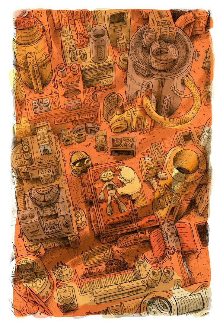
E-Tanks For All The Memories - Zac Gorman
We've got another amazing Mega Man inspired art print, this time by Zac Gorman.  I love the sketchy messiness of the image, it reminds me of a disheveled room with bits and baubles strewn about.  The color palette also gives this image an antiquated look that works really well with Mega Man mythology.  Zac Gorman's 13" x 19" "E-Tanks For All The Memories" giclĂ©e is available through the Gallery 1988's website for $40.

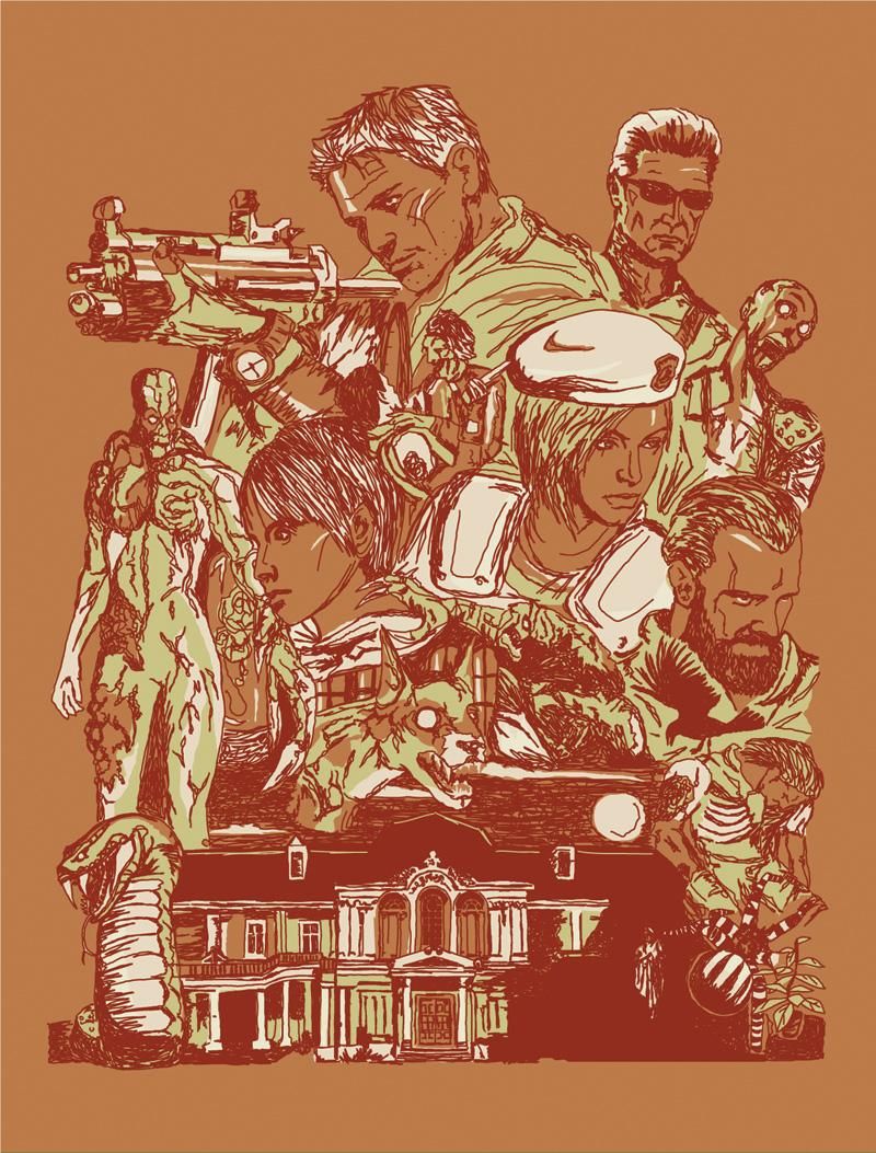
There's A Mansion Near Raccoon City - Furturtle Printworks
Weren't able to grab Daniel Danger's Silent Hill inspired print at the show? Well fret not because the fine folks at Furturtle Printworks have your back.  The granddaddy of them all, Resident Evil, inspired their print, "There's A Mansion Near Raccoon City."  I love how busy the poster is, reminds me of a fun Tyler Stout composition where heads are stacked on heads are stacked ok undead dogs (what did he say?!).  This beautiful 19" x 25" screenprint is available right now through Gallery 1988 for $30 and is limited to an edition of 50.

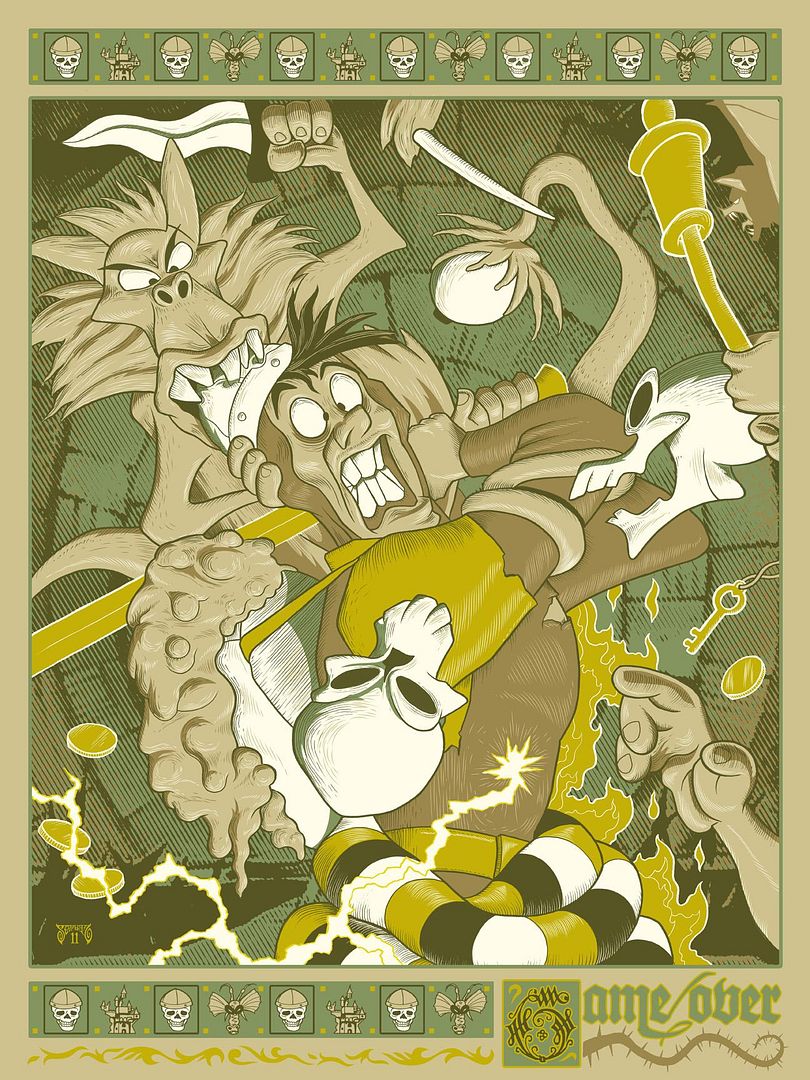
Dragon's Lair - Mike Saputo
Another classic!  I remember going to Tilt, my local arcade as a kid, and playing this game through a massive laserdisc powered machine.  I died so many times it wasn't even funny (alright, maybe a little), but I remember being in awe of the fact that I was essentially playing a Choose Your Own Adventure book in the form of a cartoon!  Mike Saputo's "Dragon's Lair" art print reminds me of all the good times (and money) I spent trying to best the dragon Singe, and perfectly captures the cartoon look of the game.  I must have this on my wall!  The 18" x 24" "Dragon's Lair" art print is available through the Gallery 1988 online store, is limited to an edition of 50 and only costs $40.

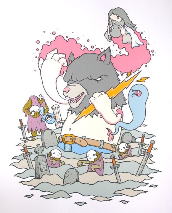
Untitled - Mike Budai
I think this may be my favorite of the second batch, because not only do I love the game Altered Beast, I think Mike Budai's clean and simple style is just screaming to adorn your walls and mine.  Budai's love letter to the side scroller of way back when is beautifully rendered in its execution and is able to both concisely and comically tell the tale of a centurion resurrected by Zeus and given the power of lycanthropy.  Clean lines, beautiful colors, arresting characters; this poster has it all.  Budai's 17.5" x 22" screenprint is limited to an edition of 50, and ONLY costs $25.  What are you waiting for?!  Head over to Gallery 1988 to pick one up for yourself.

Well that about wraps up my look at Gallery 1988's "Multiplayer" exhibit.  There were a lot of amazing posters and I really hope we see more shows like this.  If you've got some free time I also recommend checking out Zac Gorman's portfolio, Furturtle Printwork's website, Mike Saputo's showcase, and Mike Budai's blogspot.  Happy MLK day everyone!